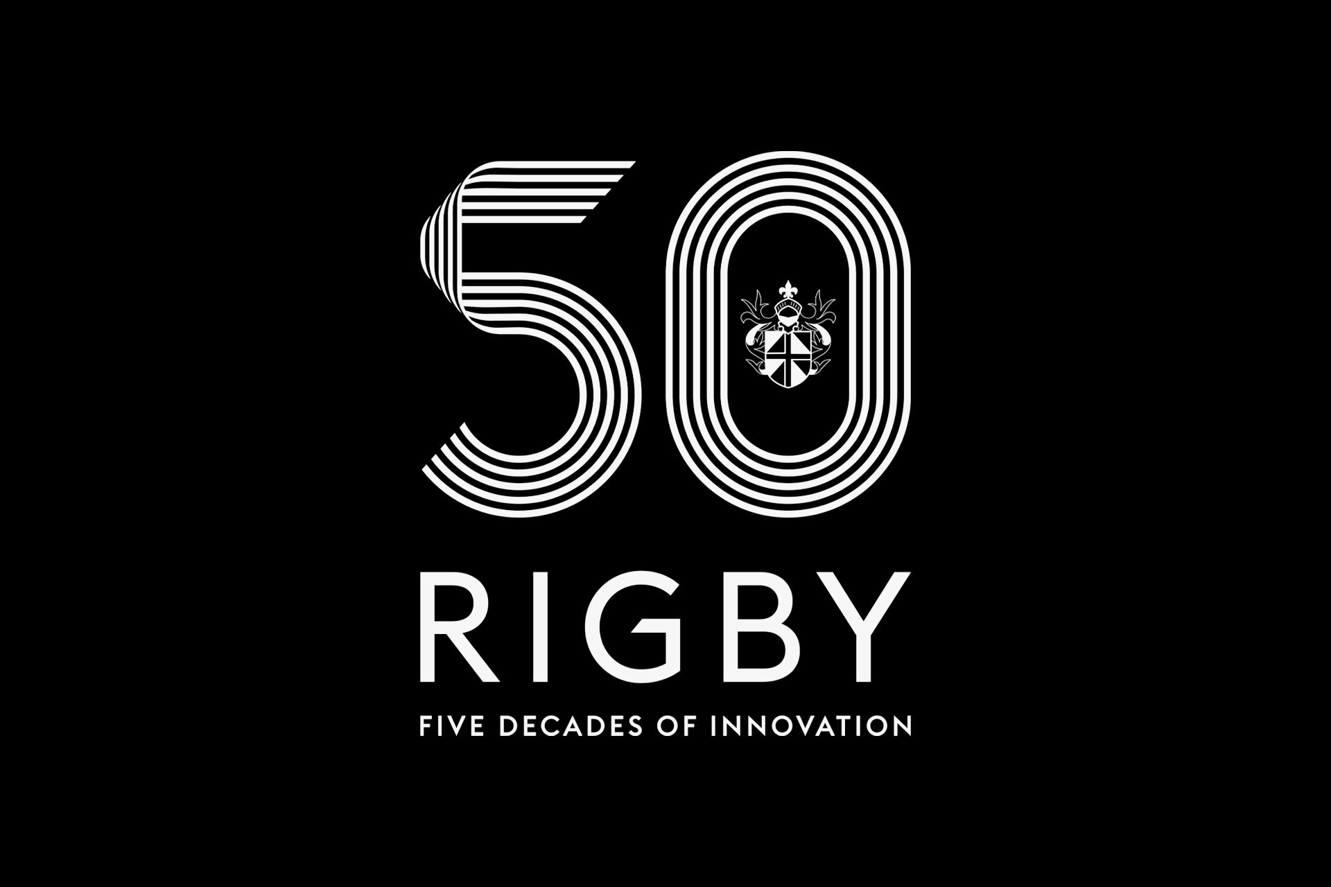
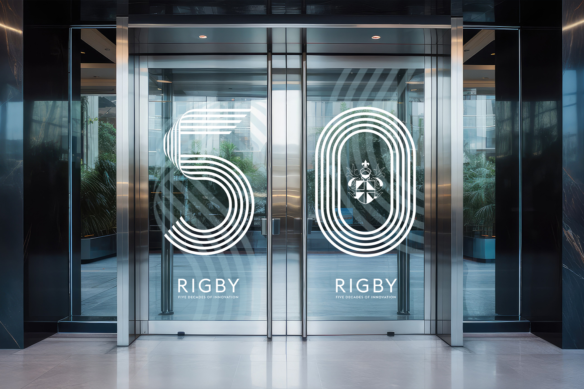
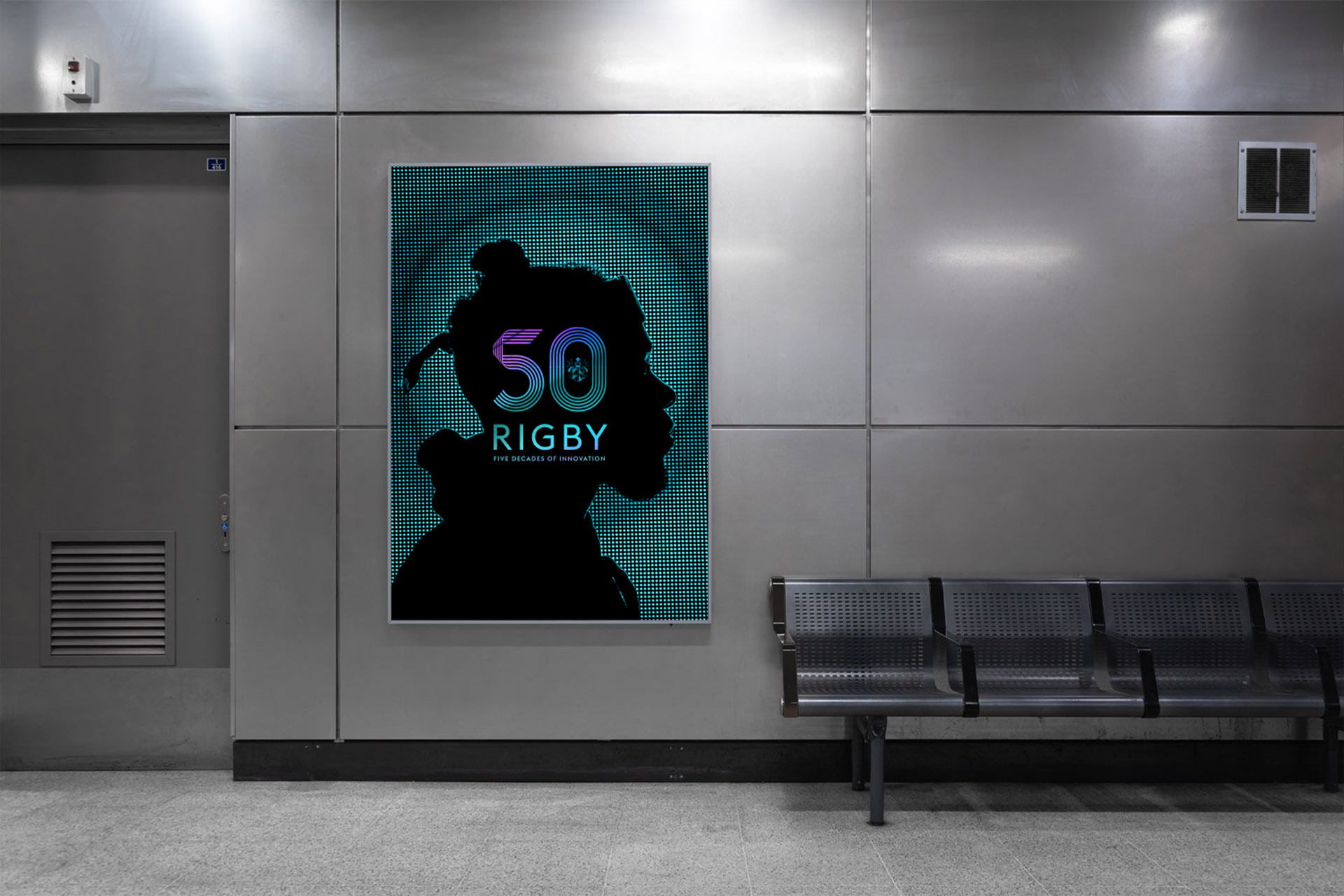
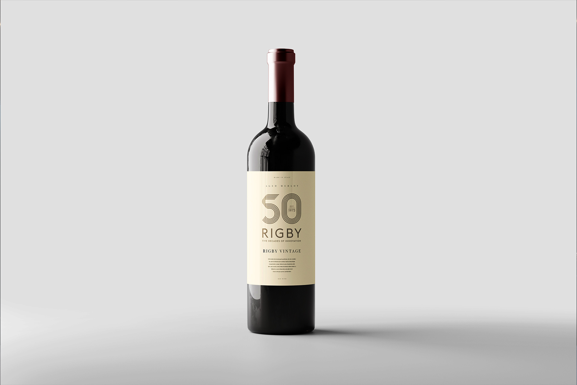
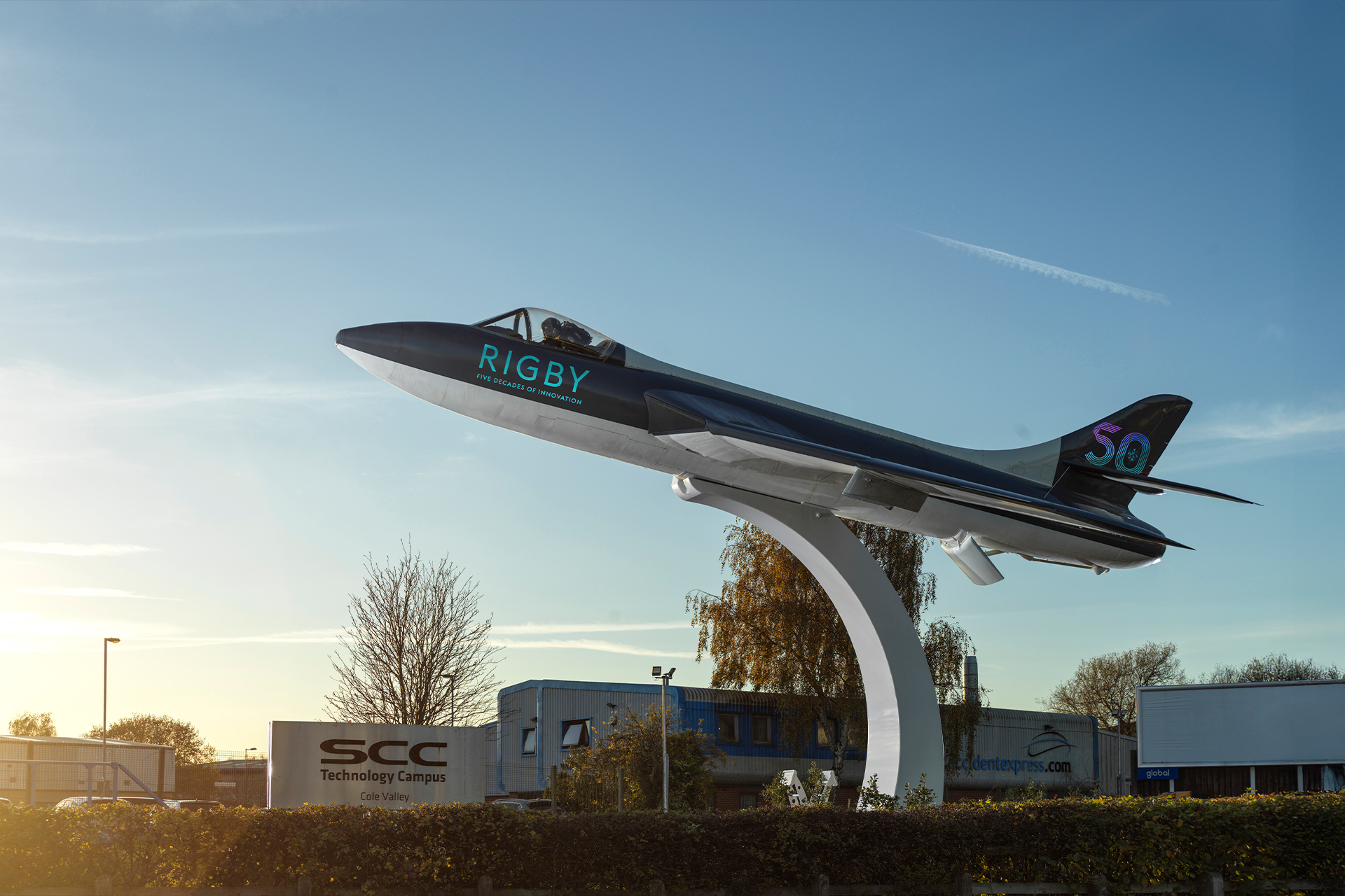
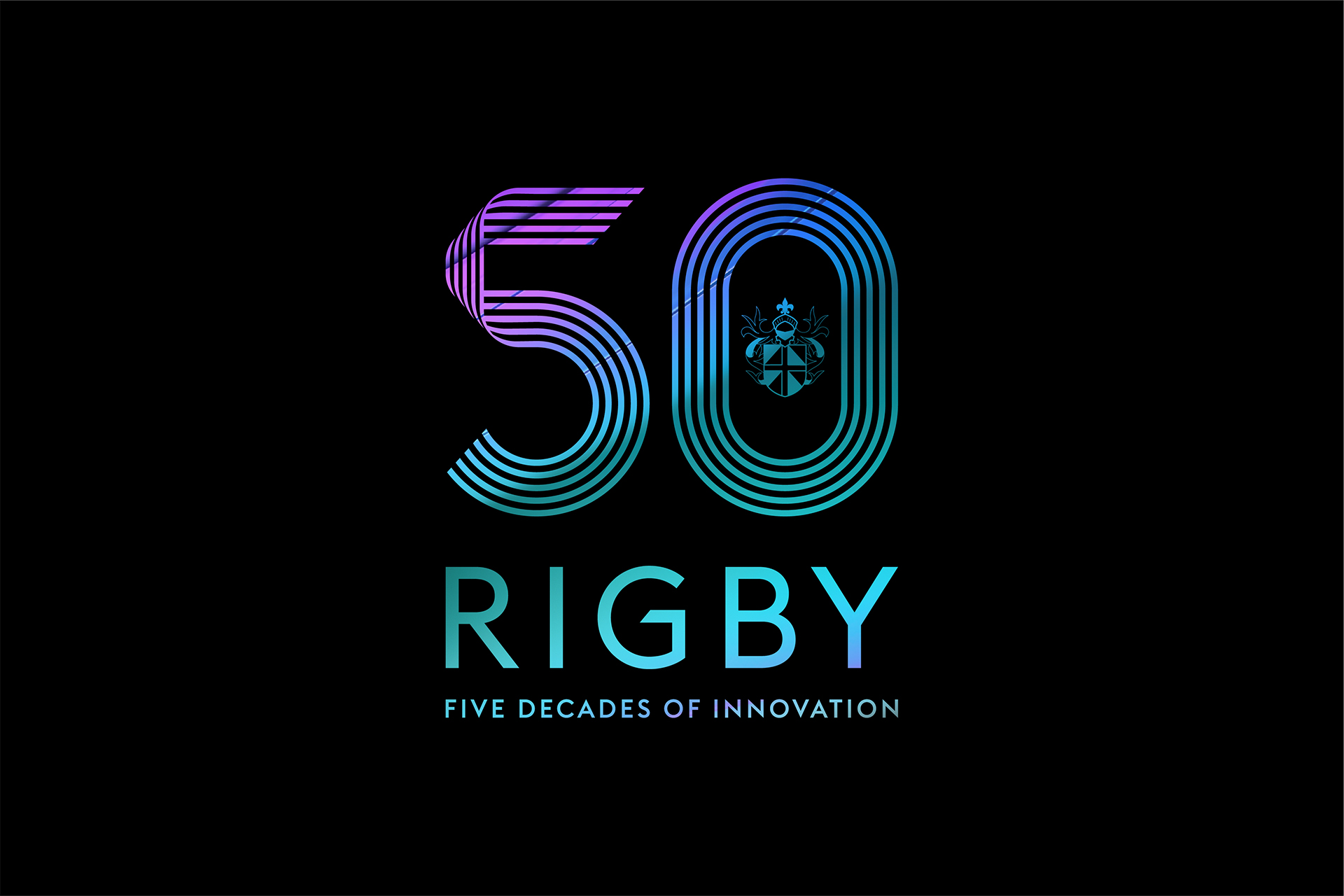
Anniversary branding for Rigby Group, marking 50 years of innovation. I designed a ribbon-like logo made of five distinct strands—each representing a decade in the company’s journey. The visual language aimed to celebrate progress while honouring the brand’s heritage, blending a sense of movement and continuity into a clean, structured mark that felt both commemorative and aligned with Rigby’s existing identity.
Designed under Z3/Studio